Accordion
Aria
RTL
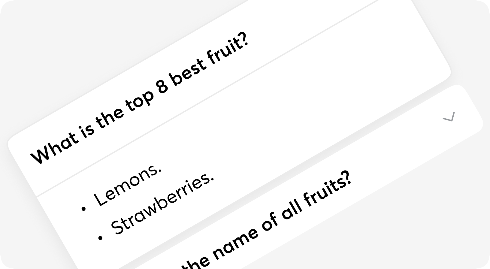
An accordion is a vertical stack of interactive headings used to toggle the display of further information; each item can be 'collapsed' with just a short label visible or 'expanded' to show the full content.
Anatomy
<Accordion>
  <Accordion.Item>
    <Accordion.Header>...</Accordion.Header>
    <Accordion.Content>...</Accordion.Content>
  </Accordion.Item>
  <Accordion.Item>
    <Accordion.Header>...</Accordion.Header>
    <Accordion.Content>...</Accordion.Content>
  </Accordion.Item>
  <Accordion.Item>
    <Accordion.Header>...</Accordion.Header>
    <Accordion.Content>...</Accordion.Content>
  </Accordion.Item>
</Accordion>
Default
Open by default
Lorem Ipsum is simply dummy text of the printing and typesetting industry. Lorem Ipsum
has been the industry's standard dummy text ever since the 1500s, when an unknown printer
took a galley of type and scrambled it to make a type specimen book.
It has survived not only five centuries, but also the leap into electronic typesetting, remaining
essentially unchanged. It was popularised in the 1960s with the release of Letraset sheets containing
Lorem Ipsum passages, and more recently with desktop publishing software like Aldus PageMaker including versions of Lorem Ipsum.
Single open
Disabled item
Content outside
Sizes
On change event
Accordion props
| Name | Type | Required | Default | Description |
|---|---|---|---|---|
| id | string | Yes | - | The id of the live component (required by LiveView for stateful components). |
| testid | string | No | - | Data-testid attribute for DOM element |
| class | css_class | No | - | Additional Tailwind classes |
| item_size | sm | md | lg | xl | No | "md" | Size of the item, header mostly |
| has_content_outside | boolean | No | false | Content looks outside |
| value | any | No | [] | Value (List of values) items to be open |
| on_change | event | No | - | Handler for open/close of the item |
| is_single_open | boolean | No | false | Close other items if true |
| item | slot | Yes | - | Accordion item, see Accordion.Item |
Accordion.Item props
| Name | Type | Required | Default | Description |
|---|---|---|---|---|
| id | string | No | - | Id attribute for DOM element |
| testid | string | No | - | Data-testid attribute for DOM element |
| class | css_class | No | - | Additional Tailwind classes |
| disabled | boolean | No | false | Disabling accordion item |
| value | string | No | - | Will be got from Accordion in most cases |
| is_open | boolean | No | - | Will be got from Accordion in most cases |
| has_content_outside | boolean | No | - | Will be got from Accordion in most cases |
| header | slot | Yes | - | Header of Accordion item, see Accordion.Header |
| content | slot | Yes | - | Content of Accordion item, see Accordion.Content |
Accordion.Header props
| Name | Type | Required | Default | Description |
|---|---|---|---|---|
| id | string | No | - | Id attribute for DOM element |
| testid | string | No | - | Data-testid attribute for DOM element |
| class | css_class | No | - | Additional Tailwind classes |
| icon_class | css_class | No | - | Additional Tailwind classes |
| title | string | No | - | Title of Accordion.Item |
| disabled | boolean | No | - | Will be got from Accordion.Item in most cases |
| is_open | boolean | No | - | Will be got from Accordion in most cases |
| size | sm | md | lg | xl | No | - | Will be got from Accordion in most cases |
| value | integer | No | - | Will be got from Accordion in most cases |
| on_change | event | No | - | Will be got from Accordion in most cases |
| is_content_outside | boolean | No | - | Will be got from Accordion in most cases |
| default | slot | No | - | Content of Accordion.Header |
Accordion.Content props
| Name | Type | Required | Default | Description |
|---|---|---|---|---|
| id | string | No | - | Id attribute for DOM element |
| testid | string | No | - | Data-testid attribute for DOM element |
| class | css_class | No | - | Additional Tailwind classes |
| size | sm | md | lg | xl | No | - | Will be got from Accordion in most cases |
| is_content_outside | boolean | No | - | Will be got from Accordion in most cases |
| default | slot | Yes | - | Content of Accordion.Content |