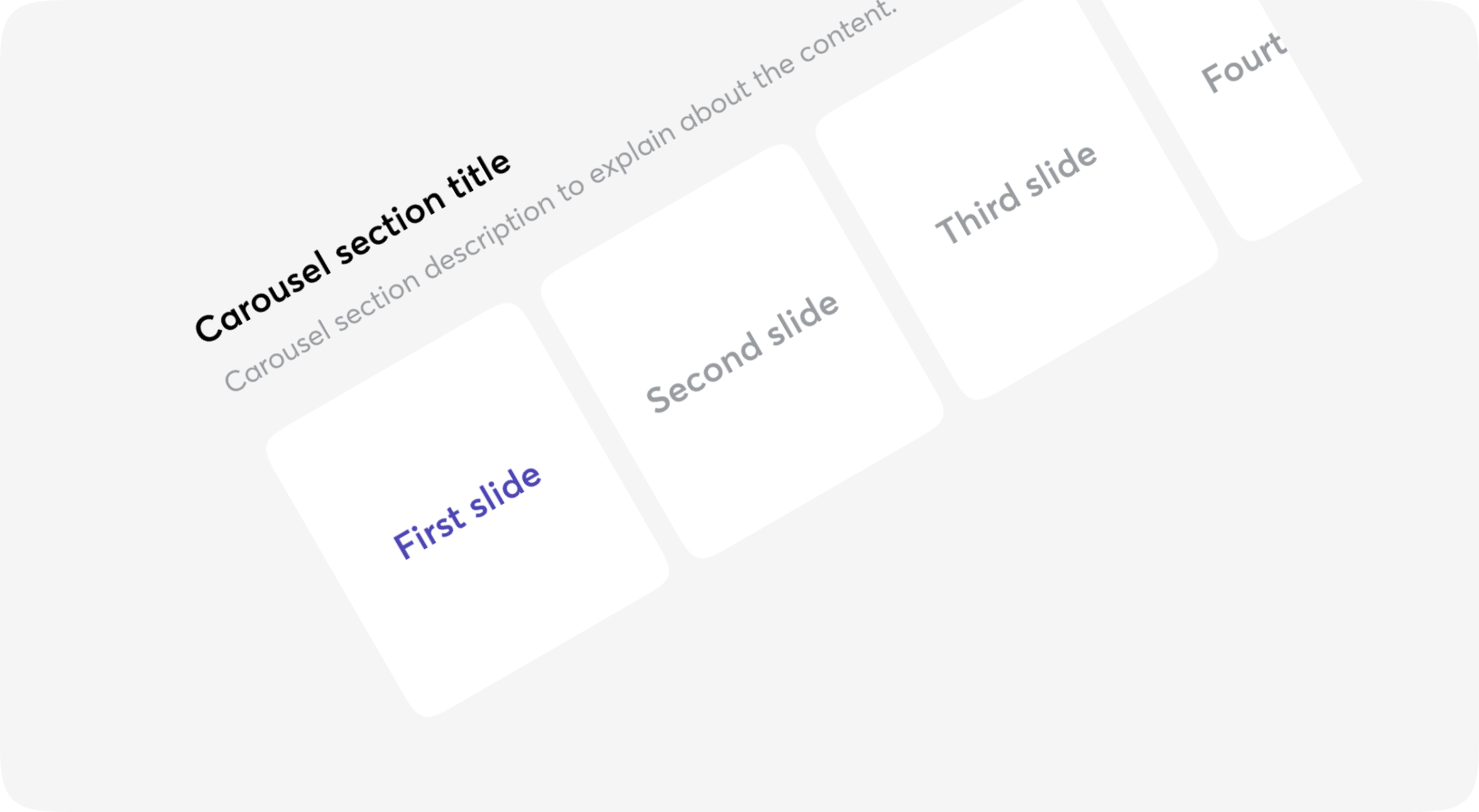
Carousel
Carousel is an effective way of displaying multiple images or content in a single space.
It not only helps in saving screen space, but also encourages visitors to focus on important website content and improves the overall visual appeal effectively.
Anatomy
<Carousel>
  <Carousel.LeftArrow>...</Carousel.LeftArrow>
  <Carousel.Reel>
    <Carousel.Item>...</Carousel.Item>
    <Carousel.Indicators />
  </Carousel.Reel>
  <Carousel.RightArrow>...</Carousel.RightArrow>
</Carousel>
Default
Customized arrows
Indicators
Spaces
Select index
Autoslide
Carousel props
| Name | Type | Required | Default | Description |
|---|---|---|---|---|
| id | string | Yes | - | The id of the live component (required by LiveView for stateful components). |
| testid | string | No | - | Data-testid attribute for DOM element |
| class | css_class | No | - | Additional Tailwind classes |
| value | integer | No | 0 | Index of selected item |
| on_change | event | No | - | The function to call when reel is updated |
| step | integer | No | 1 | Step of scroll |
| autoslide_delay | integer | No | - | Interval of auto sliding in milliseconds. No auto sliding if undefined |
| reel | slot | No | - | Reel of Carousel component, see Carousel.Reel |
| left_arrow | slot | No | - | Left arrow of Carousel component, see Carousel.LeftArrow |
| right_arrow | slot | No | - | Right arrow of Carousel component, see Carousel.RightArrow |
| default | slot | No | - | Default slot of Carousel component, used for customized arrows |
Carousel.Reel props
| Name | Type | Required | Default | Description |
|---|---|---|---|---|
| id | string | No | - | Id attribute for DOM element |
| testid | string | No | - | Data-testid attribute for DOM element |
| class | css_class | No | - | Additional Tailwind classes |
| indicator_class | css_class | No | - | Additional Tailwind classes for indicator |
| autoslide_delay | integer | No | - | Will be got from Carousel in most cases |
| step | integer | No | - | Will be got from Carousel in most cases |
| value | integer | No | - | Will be got from Carousel in most cases |
| on_change | event | No | - | Will be got from Carousel in most cases |
| item | slot | No | - | Item of Carousel component, see Carousel.Item |
| indicator | slot | No | - | Indicator of Carousel component, see Carousel.Indicator |
| default | slot | No | - | Default slot of Carousel.Reel, used for examples with auto-generated Carousel items |
Carousel.Item props
| Name | Type | Required | Default | Description |
|---|---|---|---|---|
| id | string | No | - | Id attribute for DOM element |
| testid | string | No | - | Data-testid attribute for DOM element |
| class | css_class | No | - | Additional Tailwind classes |
| value | integer | No | - | Will be got from Carousel in most cases |
| is_active | boolean | No | - | Will be got from Carousel in most cases |
| is_hidden | boolean | No | false | Conditional displaying due to an issue with named slots in Surface |
| default | slot | No | - | Inner content of the Carousel.Item |
Carousel.Indicator props
| Name | Type | Required | Default | Description |
|---|---|---|---|---|
| id | string | No | - | Id attribute for DOM element |
| testid | string | No | - | Data-testid attribute for DOM element |
| class | css_class | No | - | Additional Tailwind classes |
| default_bg_color | css_class | No | "bg-beerus" | Additional Tailwind classes for background color of indicator in default state |
| selected_bg_color | css_class | No | "bg-piccolo" | Additional Tailwind classes for background color of indicator in selected state |
| on_change | event | No | - | Will be got from Carousel in most cases |
| value | integer | No | - | Will be got from Carousel in most cases |
Carousel.LeftArrow props
| Name | Type | Required | Default | Description |
|---|---|---|---|---|
| id | string | No | - | Id attribute for DOM element |
| testid | string | No | - | Data-testid attribute for DOM element |
| class | css_class | No | - | Additional Tailwind classes |
| on_change | event | No | - | Will be got from Carousel in most cases |
| value | integer | No | - | Will be got from Carousel in most cases |
| default | slot | Yes | - | Inner content of the component |
Carousel.RightArrow props
| Name | Type | Required | Default | Description |
|---|---|---|---|---|
| id | string | No | - | Id attribute for DOM element |
| testid | string | No | - | Data-testid attribute for DOM element |
| class | css_class | No | - | Additional Tailwind classes |
| on_change | event | No | - | Will be got from Carousel in most cases |
| value | integer | No | - | Will be got from Carousel in most cases |
| default | slot | Yes | - | Inner content of the component |