Switch
Aria
RTL
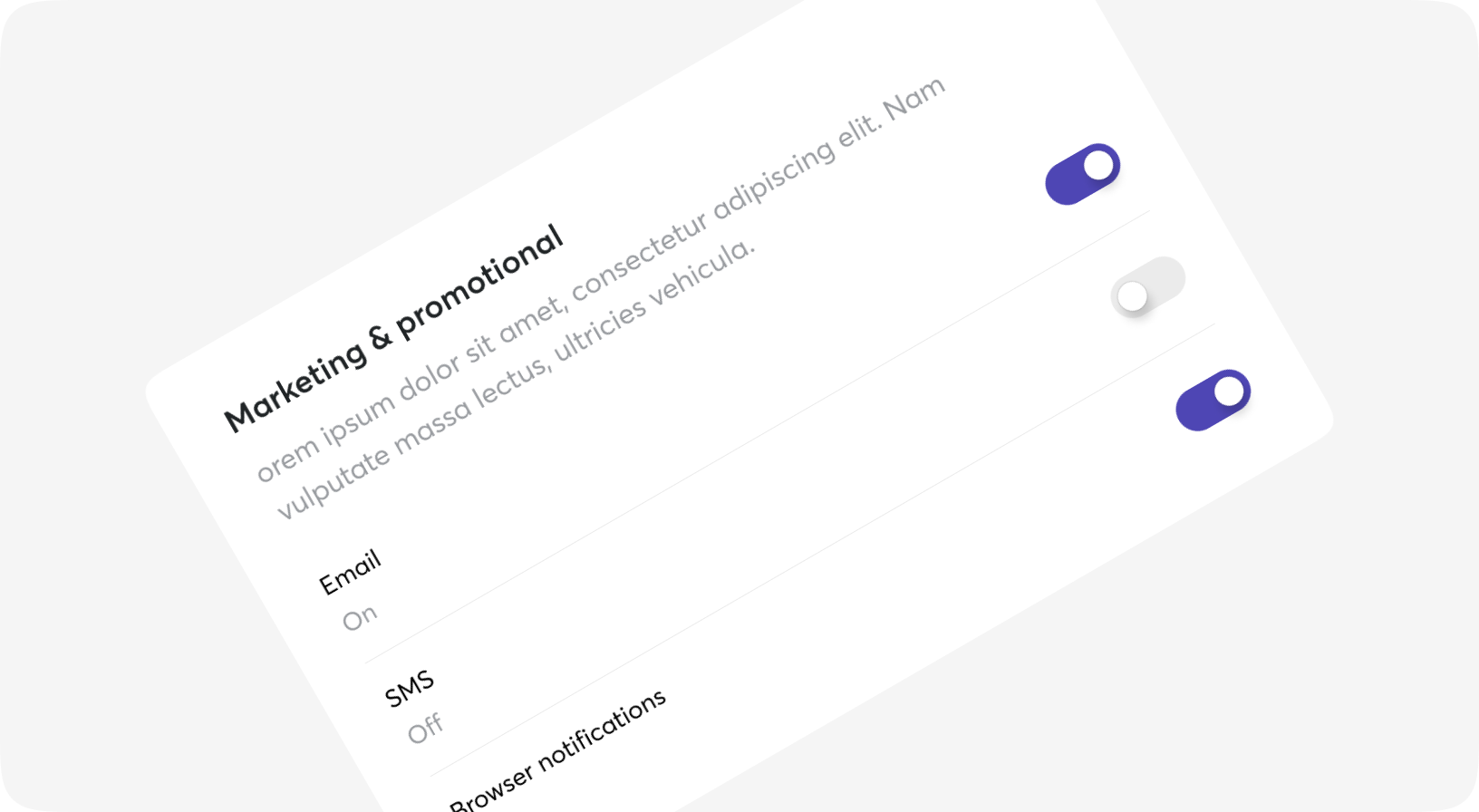
Switch is a control that is used to quickly switch between two possible states.
Switches are only used for these binary actions that occur immediately after the user “flips” the switch.
They are commonly used for “on/off” switches.

Default
Sizes
Disabled
With icons
Custom background
Using with forms
Code example for full customization
On change
State
@is_dark = false # example works only in our site's context
Switch props
| Name | Type | Required | Default | Description |
|---|---|---|---|---|
| checked | boolean | No | false | Is switch checked/unchecked |
| disabled | boolean | No | - | Set disabled/not disabled switch |
| on_bg_color | css_class | No | bg-piccolo | Tailwind class for custom on-state background color |
| off_bg_color | css_class | No | bg-beerus | Tailwind class for custom off-state background color |
| on_icon | slot | No | - | Set icon for checked state |
| off_icon | slot | No | - | Set icon for unchecked state |
| size | 2xs | xs | sm | No | sm | Size of switch |
| on_change | event | No | - | The function to call when the switch is toggled |
| class | css_class | No | - | Tailwind classes for customization |
| switcher_class | css_class | No | - | Tailwind classes for customization of switcher element |