Radio
Aria
RTL
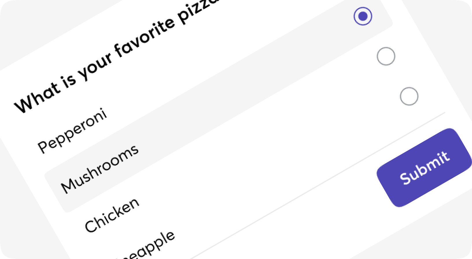
Radio buttons are used to represent a group of choices whereby users can only select one option.
The main difference between the radio button and the checkbox is, users are allowed to select single options whereas in the checkbox you can have multiple options.
Anatomy
<Radio value="..." on_change="...">
  <Radio.Button value="...">
    <Radio.Indicator /> ...
  </Radio.Button>
  <Radio.Button value="...">
    <Radio.Indicator /> ...
  </Radio.Button>
</Radio>
Default
Disabled
With form
Customizations
Form.Radio props
Radio(group) component. For using both inside and outside the form
| Name | Type | Required | Default | Description |
|---|---|---|---|---|
| id | string | No | - | Id to be given to the label tag |
| testid | string | No | - | Data-testid attribute value |
| class | css_class | No | - | Additional CSS classes for the label |
| field | atom | No | - | Field name, surface-style |
| disabled | boolean | No | - | Well, disabled |
| value | any | No | - | Value of the selected option, use it outside the form |
| on_change | event | No | - | On-change event, will be propagated to underlying options |
| options | keyword | No | [] | List of options to be rendered when no option slot is given |
| option_module | atom | No | Moon.Design.Form.Radio.Button | Module for rendering options |
| hide_errors | boolean | No | - | See Moon.Design.Field documentation |
| hint | string | No | - | See Moon.Design.Field documentation |
| option | slot | No | - | List of options for Radiogroup |
| default | slot | No | - | Additional slot, here you able to add anything |
Form.Radio.Button props
Single component of the Radio, renders to a label
| Name | Type | Required | Default | Description |
|---|---|---|---|---|
| id | string | No | - | Id to be given to the label tag |
| testid | string | No | - | Data-testid attribute value |
| class | css_class | No | - | Additional CSS classes for the label |
| field | atom | No | - | Field name, surface-style |
| form | form | No | - | Form, surface-style |
| is_selected | boolean | No | - | Making the radio selected, use it outside the form. In most cases is set by Radio component |
| on_click | event | No | - | - |
| value | string | No | - | - |
| disabled | boolean | No | - | - |
| label | string | No | - | Label to be shown when no default slot is given |
| size | sm | md | lg | No | "md" | Size of the label |
| default | slot | No | - | Inner content - put label & <Indicator/> here |
Form.Radio.Indicator props
Radio round mark to be shown
| Name | Type | Required | Default | Description |
|---|---|---|---|---|
| id | string | No | - | Id attribute to be given to the HTML tag |
| class | css_class | No | - | Additional CSS classes for the mark |
| testid | string | No | - | Data-testid attribute value |
| is_selected | boolean | No | - | If the mark should be checked |