Input
RTL
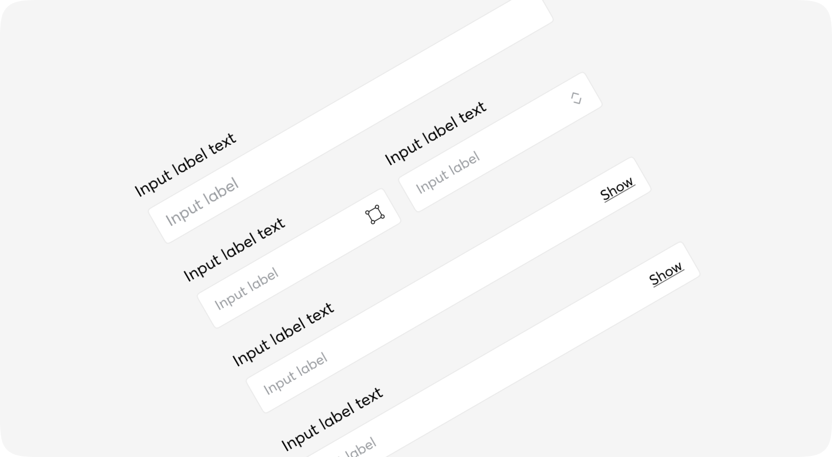
Text input fields allow users to enter text and can be used to collect user feedback or enter information in data entry forms.
These types of input fields are used on their own, or in combination with other inputs such as number entry, date picker, etc.
Default
States
Sizes
Types
With label
With horizontal label
With hint
Form props
| Name | Type | Required | Default | Description |
|---|---|---|---|---|
| id | string | No | - | Id attribute for DOM element |
| testid | string | No | - | Data-testid attribute for DOM element |
| for | any | No | - | Atom or changeset to inform the form data |
| as | atom | No | - | The server side parameter in which all parameters will be gathered. |
| change | event | No | - | Triggered when the form is changed |
| submit | event | No | - | Triggered when the form is submitted |
| class | string | No | - | Additional Tailwind classes |
| autocomplete | on | off | No | "on" | Whether autocomplete is enabled |
| target | any | No | - | Target |
| action | string | No | - | URL to where the form is submitted |
| trigger_action | any | No | - | Trigger a standard form submit on DOM patch to the URL specified in the form's standard action attribute. This is useful to perform pre-final validation of a LiveView form submit before posting to a controller route for operations that require Plug session mutation. |
| is_horizontal | boolean | No | false | Whether label is on side of input field |
| has_error_icon | boolean | No | false | Whether error icon is shown |
| attrs | map | No | %{} | Additional ttributes to be added to form tag |
| default | slot | No | - | Default slot |
Form.Input props
| Name | Type | Required | Default | Description |
|---|---|---|---|---|
| id | string | No | - | Id to be given to the input tag |
| field | atom | No | - | Name of the field, usually should be taken from context |
| form | form | No | - | Form info, usually should be taken from context |
| size | sm | md | lg | No | "md" | Common moon size property |
| error | boolean | No | - | Some additional styling will be set to indicate the field is invalid. Generally should be set by Form.Field or Form.InsetField component |
| type | date | month | datetime-local | email | number | password | search | tel | text | time | url | No | "text" | HTML5 type of the input, please don't use checkbox or radio here |
| placeholder | string | No | " " | Text to be set as a HTML placeholder attribute - when input is empty |
| class | css_class | No | - | Additional classes for the <input> tag |
| field_class | css_class | No | - | Additional classes for the <input> tag in case of floating label or Group |
| value | string | No | - | Value of the input, don't use it inside the forms |
| testid | string | No | - | Data-testid attribute value |
| disabled | boolean | No | - | HTML disabled attribute for the input & some additional classes. Generally should be set by Form.Field or Form.InsetField component |
| readonly | boolean | No | - | Readonly - some additional classes and behaviour. Generally should be set by Form.Field or Form.InsetField component |
| autocomplete | string | No | - | Autocomplete HTML attribute for the input, use "off" to disable |
| opts | any | No | %{} | Keyword | Map of additional attributes for the input |
| on_change | event | No | - | On change event for the input - don't use it inside phoenix forms |
| on_keyup | event | No | - | On keyup event for the input |
| on_focus | event | No | - | On focus event for the input |
| on_blur | event | No | - | On blur event for the input |
Form.Field props
| Name | Type | Required | Default | Description |
|---|---|---|---|---|
| id | string | No | - | id attribute for DOM element |
| form | form | No | - | Form, Surface-style |
| field | atom | No | - | Field, Surface-style |
| size | sm | md | lg | No | "md" | Input size |
| label | string | No | - | Label for input field |
| hint | string | No | - | Hint for input field |
| hide_errors | boolean | No | - | Whether error message is shown |
| class | css_class | No | - | Additional Tailwind classes |
| error_class | css_class | No | - | Additional Tailwind classes |
| hint_class | css_class | No | - | Additional Tailwind classes |
| testid | string | No | - | data-testid attribute for DOM element |
| is_horizontal | boolean | No | - | Whether label is on side of input field |
| has_error_icon | boolean | No | - | Whether error icon is shown |
| attrs | map | No | - | - |
| default | slot | No | - | Inner content of the component |