Select
Aria
RTL
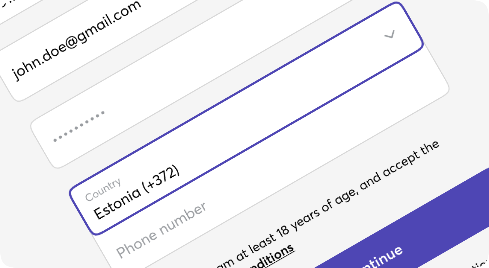
A form input used for selecting a value: when collapsed it shows the currently selected option and when expanded, it shows a scrollable list of predefined options for the user to choose from. Options are not styled here. For list with styled options please use Dropdown component.
Default
Sizes
With label
Disabled and error
With hint
Form.Select props
| Name | Type | Required | Default | Description |
|---|---|---|---|---|
| id | string | No | - | Id to be given to the select tag |
| field | atom | No | - | Name of the field, usually should be taken from context |
| form | form | No | - | Form info, usually should be taken from context |
| options | list | No | [] | Options for select. Or list of keyword, either list of maps. Format: [%{key: shown_label, value: option_value, disabled: bool}], diisabled is optional |
| value | any | No | - | Selected option(s) value - do not use it inside the form, just for away-from-form components |
| disabled | boolean | No | - | Well, disabled |
| size | sm | md | lg | No | "md" | Common moon size property |
| class | css_class | No | - | Additional classes for the <select> tag |
| field_class | css_class | No | - | Additional classes for the <select> tag in case of floating label or Group |
| prompt | string | No | - | Some prompt to be shown on empty value |
| testid | string | No | - | Data-testid attribute value |
| error | boolean | No | - | Some additional styling will be set to indicate the field is invalid. Generally should be set by Form.Field component |