Dropdown
Aria
RTL
Dropdowns is a custom select component that allows users to make single or multiple selections.
An option that's been selected can represent a corresponding value in forms or be used to filter/sort content.
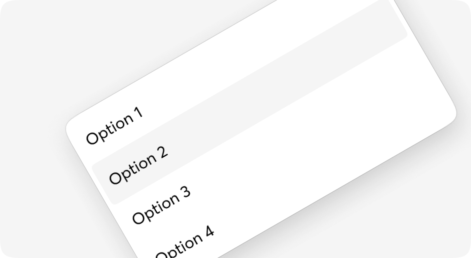
Anatomy
<Dropdown>
  <Dropdown.Options>
    <Dropdown.Option>...</Dropdown.Option>
    <Dropdown.Option>...</Dropdown.Option>
    <Dropdown.Option>...</Dropdown.Option>
  </Dropdown.Options>
  <Dropdown.Trigger>...</Dropdown.Trigger>
</Dropdown>
Default
Trigger elements
Option layouts
Positions
Sizes
Datepicker
May 2025
m
t
w
t
f
s
s
Responsive dropdown
With form
States
Multiple
Custom
Dropdown props
Component for rendering dropdown info, mostly lists
| Name | Type | Required | Default | Description |
|---|---|---|---|---|
| id | string | Yes | - | The id of the live component (required by LiveView for stateful components). |
| value | any | No | - | Value(s) of the options to be marked as selected |
| on_trigger | event | No | - | Event fired when trigger is clicked |
| on_close | event | No | - | Event fired to close Dropdown.BottomOptions |
| is_open | boolean | No | - | Put true here if you want dropdown to be shown by default |
| class | css_class | No | - | Addictional classes to be added to a dropdown |
| testid | string | No | - | Data-testid attribute for HTML tag |
| autoclose | boolean | No | true | Dropdown autoclose on click away |
| disabled | boolean | No | - | Disabled state for the dropdown |
| hook | string | No | - | Attribute phx-hook. Used for dependant components |
| side_values | map | No | %{} | Additional values to be passed |
| on_change | event | No | - | Event fired when option is selected |
| trigger | slot | Yes | - | Slot for triggering the open/closing state |
| default | slot | No | - | Content to be showable |
| backdrop | slot | No | - | Backdrop of Dropdown as BottomSheet on small screens, see Dropdown.Backdrop |
Dropdown.Options props
Options list for the Dropdown component
| Name | Type | Required | Default | Description |
|---|---|---|---|---|
| id | string | No | - | Id attribute for div |
| value | any | No | - | Value of the selected option(s) |
| on_change | event | No | - | On option click event, in most cases got from context |
| is_open | boolean | No | - | If the optionlist is open, got from context |
| size | sm | md | lg | No | "md" | Size of the options |
| class | css_class | No | - | Additional CSS classes for the div |
| position | top-start | top | top-end | bottom-start | bottom | bottom-end | right-start | right | right-end | left-start | left | left-end | No | - | Specifies the position of the dropdown |
| values | map | No | - | Additional values to be passed |
| titles | list | No | [] | List of the options. Used when no option slot is given |
| option_module | atom | No | Moon.Design.Dropdown.Option | Option module |
| testid | string | No | - | Data-testid attribute for div |
| option | slot | No | - | - |
| default | slot | No | - | - |
| header | slot | No | - | - |
| footer | slot | No | - | - |
Dropdown.Trigger props
Element that triggers Dropdown component, renders with no HTML tag
| Name | Type | Required | Default | Description |
|---|---|---|---|---|
| title | string | No | - | Title to be shown when no defaul slot given |
| is_open | boolean | No | - | If the trigger is open. Should be taken from context |
| on_click | event | No | - | Event that fired when trigger is clicked |
| testid | string | No | - | Data-testid attribute for HTML tag |
| class | css_class | No | - | Additional Tailwind classes |
| disabled | boolean | No | - | If the item should be marked as disabled |
| default | slot | No | - | Inner content of the component |
Dropdown.Option props
Single oprion for the dropdown component. Renders as a button
| Name | Type | Required | Default | Description |
|---|---|---|---|---|
| id | string | No | - | Id attribute for buttons |
| testid | string | No | - | Data-testid attribute for button |
| title | string | No | - | Title to be shown when no default slot is given |
| class | css_class | No | - | Additional CSS classes for the button tag |
| disabled | boolean | No | - | If the button is disabled |
| hook | string | No | - | Attribute phx-hook. Used for dependant components |
| on_click | event | No | - | On click event, in most cases got from context |
| value | any | No | - | Value of the option, in most cases got from context |
| is_selected | boolean | No | - | If the option is selected, in most cases got from context |
| size | sm | md | lg | No | - | Text size & paddings for the option. Is set by Dropdown.Options in most cases |
| values | map | No | - | Additional values to be passed |
| default | slot | No | - | Inner content of the option |
Dropdown.BottomOptions props
Options list for the Dropdown component
| Name | Type | Required | Default | Description |
|---|---|---|---|---|
| id | string | No | - | Id attribute for div |
| value | any | No | - | Value of the selected option(s) |
| on_change | event | No | - | On option click event, in most cases got from context |
| on_close | event | No | - | Click event, in most cases got from context |
| is_open | boolean | No | - | If the optionlist is open, got from context |
| size | sm | md | lg | No | "md" | Size of the options |
| class | css_class | No | - | Additional CSS classes for the div |
| values | map | No | - | Additional values to be passed |
| titles | list | No | [] | List of the options. Used when no |
| option_module | atom | No | Moon.Design.Dropdown.Option | - |
| testid | string | No | - | Data-testid attribute for div |
| option | slot | No | - | - |
| default | slot | No | - | - |
Dropdown.Backdrop props
| Name | Type | Required | Default | Description |
|---|---|---|---|---|
| id | string | No | - | Id attribute for html tag |
| testid | string | No | - | Data-testid attribute for html tag |
| class | css_class | No | - | Additional CSS classes for the html tag |
| is_open | boolean | No | - | If the optionlist is open, got from context |
Dropdown.Header props
Optional dropdown header
| Name | Type | Required | Default | Description |
|---|---|---|---|---|
| id | string | No | - | Id attribute for HTML tag |
| testid | string | No | - | Data-testid attribute for HTML tag |
| class | css_class | No | - | Additional Taiilwind classes |
| default | slot | No | - | Inner content of the component |
Dropdown.Footer props
Optional dropdown header
| Name | Type | Required | Default | Description |
|---|---|---|---|---|
| id | string | No | - | Id attribute for HTML tag |
| testid | string | No | - | Data-testid attribute for HTML tag |
| class | css_class | No | - | Additional Taiilwind classes |
| default | slot | No | - | Inner content of the component |
Dropdown.CustomOption props
Single oprion for the dropdown component. Renders as a button
| Name | Type | Required | Default | Description |
|---|---|---|---|---|
| id | string | No | - | Id attribute for buttons |
| testid | string | No | - | Data-testid attribute for button |
| title | string | No | - | Title to be shown when no default slot is given |
| class | css_class | No | - | Additional CSS classes for the button tag |
| disabled | boolean | No | - | If the button is disabled |
| on_click | event | No | - | On click event, in most cases got from context |
| value | any | No | - | Value of the option, in most cases got from context |
| is_selected | boolean | No | - | If the option is selected, in most cases got from context |
| has_bottom_divider | boolean | No | false | Adds section divider after the option |
| values | map | No | - | Additional values to be passed |
| default | slot | No | - | Inner content of the option |
Form.Dropdown props
Fully styled select component for the forms
| Name | Type | Required | Default | Description |
|---|---|---|---|---|
| id | string | No | - | Id to be given to the select tag |
| options | list | Yes | - | ... format: [%{key: shown_label, value: option_value, disabled: bool}], diisabled is optional |
| field | atom | No | - | Name of the field, usually should be taken from context |
| form | form | No | - | Form info, usually should be taken from context |
| value | any | No | - | Selected option(s) value - do not use it inside the form, just for away-from-form components |
| disabled | boolean | No | - | Well, disabled |
| size | sm | md | lg | No | "md" | Common moon size property |
| class | css_class | No | - | Additional classes for the <select> tag |
| prompt | string | No | - | Some prompt to be shown on empty value |
| testid | string | No | - | Data-testid attribute value |
| error | boolean | No | - | Some additional styling will be set to indicate field is iinvalid |
| is_multiple | boolean | No | - | If field does support multiselect, `multiple` attribute for select tag in HTML terms |
| is_open | boolean | No | - | Should dropdown be open |
| default | slot | No | - | Option for custom stylings - use it to show icons or anything else |
| trigger | slot | No | - | Trigger element for the dropdown, default is Dropdown.Select |
| option | slot | No | - | Slot used for rendering single option. option[:key] will be used if not given |
Dropdown.Select props
Element that triggers Dropdown component, renders as a button
| Name | Type | Required | Default | Description |
|---|---|---|---|---|
| id | string | No | - | Id attribute for html tag |
| testid | string | No | - | Data-testid attribute for html tag |
| class | css_class | No | - | Additional CSS classes for the html tag |
| prompt | string | No | "..." | Text to be shown when no value given |
| value | string | No | - | Value to be shown |
| badge | integer | No | - | Badge to show selected items count or smth else |
| error | boolean | No | - | Some additional styling will be set to indicate field is iinvalid |
| is_open | boolean | No | - | If the open indicator is active or not |
| size | sm | md | lg | No | - | Site of the select |
| disabled | boolean | No | - | If the item should be marked as disabled |
| on_click | event | No | - | Event that fired when trigger is clicked |
| default | slot | No | - | Content of the button |