Getting started
Components usage
Use search to find components, each component in the library has its own unique name, which corresponds to the name in the code.
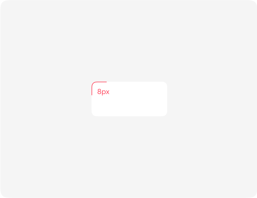
Drag the component you are using to your work area (product templates). Please note that there may be hidden layers inside the component to add various elements. Components can be in different states depending on your layout.
Use the Figma - Variants menu to switch states.

Colour convention and rules
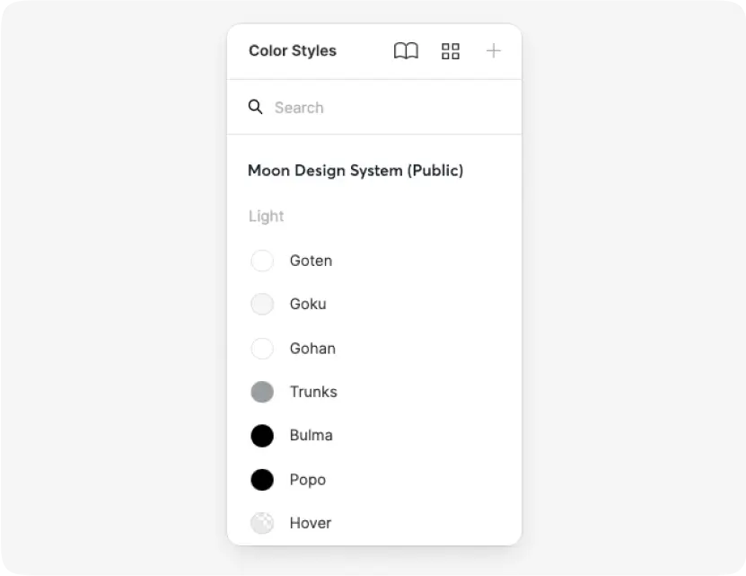
What makes our color system different?
For that, we made a decision to give our colours unique names.
Meet the Dragon Ball Z approach.
Each color name is assigned for specific purpose and for each product these values are different.
Product colours
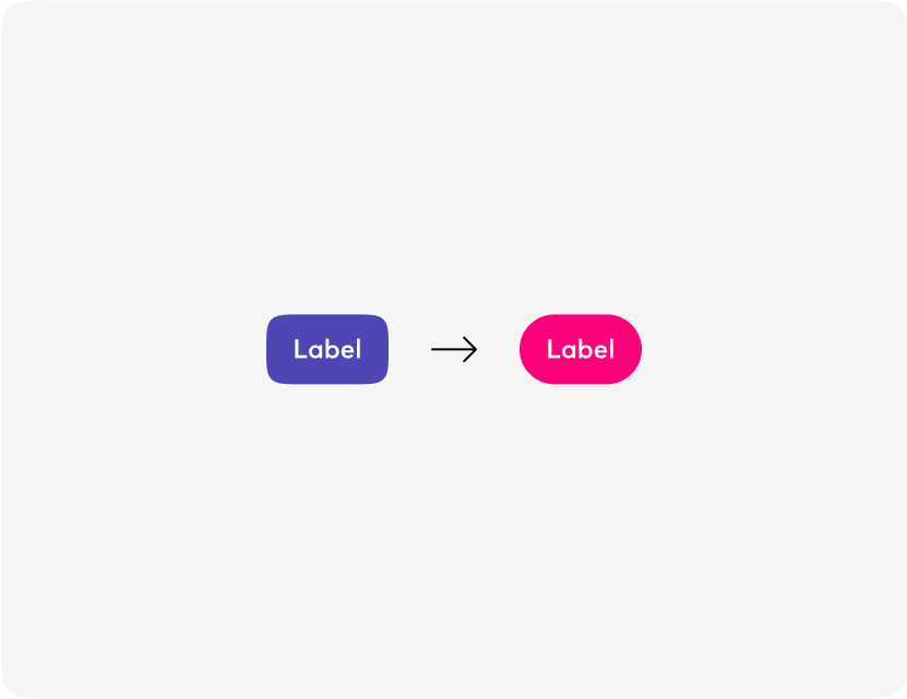
How to create your own custom colours based on the Moon colour convention.
- Check the guide for colours
- Duplicate Colours file
- Replace colour values one by one
- Publish Library
- Enable it from the "Asset panel"
- 🎉 Enjoy your new theme.
Typography
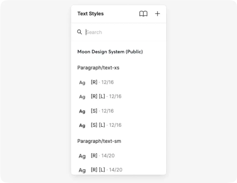
Grid of font sizes for web and mobile devices used in components.
Styles contain:
- font size
- font weight
- line height
- letter spacing
We also use 2 types of typo:
- Paragraph - for regular text
- UI type - for UI elements (buttons, inputs, which helps developers)
Product tokens
Design tokens are the collections of variables that customise Moon components for your product.
- Find tokens page in your copy of the components file
- Change the values to your product ones
- Publish Library
- Share tokens with your product front-end dev
- 🎉 Enjoy your new theme.