Combobox
Aria
RTL
An input that behaves similarly to a dropdown, with the addition of a free text input to filter options.
Anatomy
<Form>
  <Form.Field>
    <Form.Combobox options={...} />
  </Form.Field>
</Form>
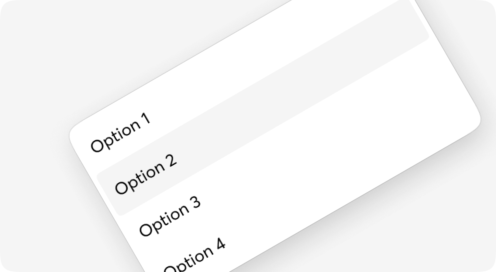
Default
Multiple
Form.Combobox props
Fully customized select component for the forms with input for filtering
| Name | Type | Required | Default | Description |
|---|---|---|---|---|
| id | string | No | - | Id to be given to the select tag |
| options | list | Yes | - | ... format: [%{key: shown_label, value: option_value, disabled: bool}], diisabled is optional |
| field | atom | No | - | Name of the field, usually should be taken from context |
| form | form | No | - | Form info, usually should be taken from context |
| value | any | No | - | Selected option(s) value - do not use it inside the form, just for away-from-form components |
| disabled | boolean | No | - | HTML disabled attribute for the input & some additional classes |
| size | sm | md | lg | No | "md" | Common moon size property |
| class | css_class | No | - | Additional classes for the <select> tag |
| prompt | string | No | - | Some prompt to be shown on empty value |
| testid | string | No | - | Data-testid attribute value |
| error | boolean | No | - | Some additional styling will be set to indicate field is invalid |
| is_multiple | boolean | No | - | If field does support multiselect, `multiple` attribute for select tag in HTML terms |
| is_open | boolean | No | - | Should dropdown be open |
| attrs | any | No | %{} | Keyword | Map of additional attributes for the input |
| on_keyup | event | No | - | On key up event for the input - use it for filter options outside the form |
| filter | string | No | - | Filtering value for the options |
| on_focus | event | No | - | - |
| on_blur | event | No | - | - |
| default | slot | No | - | Option for custom stylings - use it to show icons or anything else |
| trigger | slot | No | - | Trigger element for the dropdown, default is Dropdown.Select |
| option | slot | No | - | Slot used for rendering single option. option[:key] will be used if not given |
Dropdown.Input props
Element that triggers Dropdown component, renders as a HTML input inside div with some addons
| Name | Type | Required | Default | Description |
|---|---|---|---|---|
| id | string | No | - | Id attribute for html tag |
| testid | string | No | - | Data-testid attribute for html tag |
| class | css_class | No | - | Additional CSS classes for the html tag |
| field_class | css_class | No | - | Additional classes for the <input> tag in case of floating label or Group |
| placeholder | string | No | - | Text to be shown when no value given |
| value | string | No | - | Value to be shown |
| error | boolean | No | - | Some additional styling will be set to indicate field is iinvalid |
| size | sm | md | lg | No | - | Site of the select |
| disabled | boolean | No | - | If the item should be marked as disabled |
| open_me | event | No | - | Dropdown opening action, only from context |
| on_keyup | event | No | - | Actually - on_keyup event for the input, use it for filter options with new user input |
| on_trigger | event | No | - | Event that fired when trigger is clicked |
| is_open | boolean | No | - | If the open indicator is active or not |
| attrs | any | No | %{} | Keyword | Map of additional attributes for the input |
| on_focus | event | No | - | - |
| on_blur | event | No | - | - |
| default | slot | No | - | Some buttons and icons over the input |