IconButton
Buttons allow users to take actions, and make choices, with a single tap.
Buttons communicate actions that users can take. They are typically placed throughout your UI, in places like:
- Modal windows
- Forms
- Cards
- Toolbars
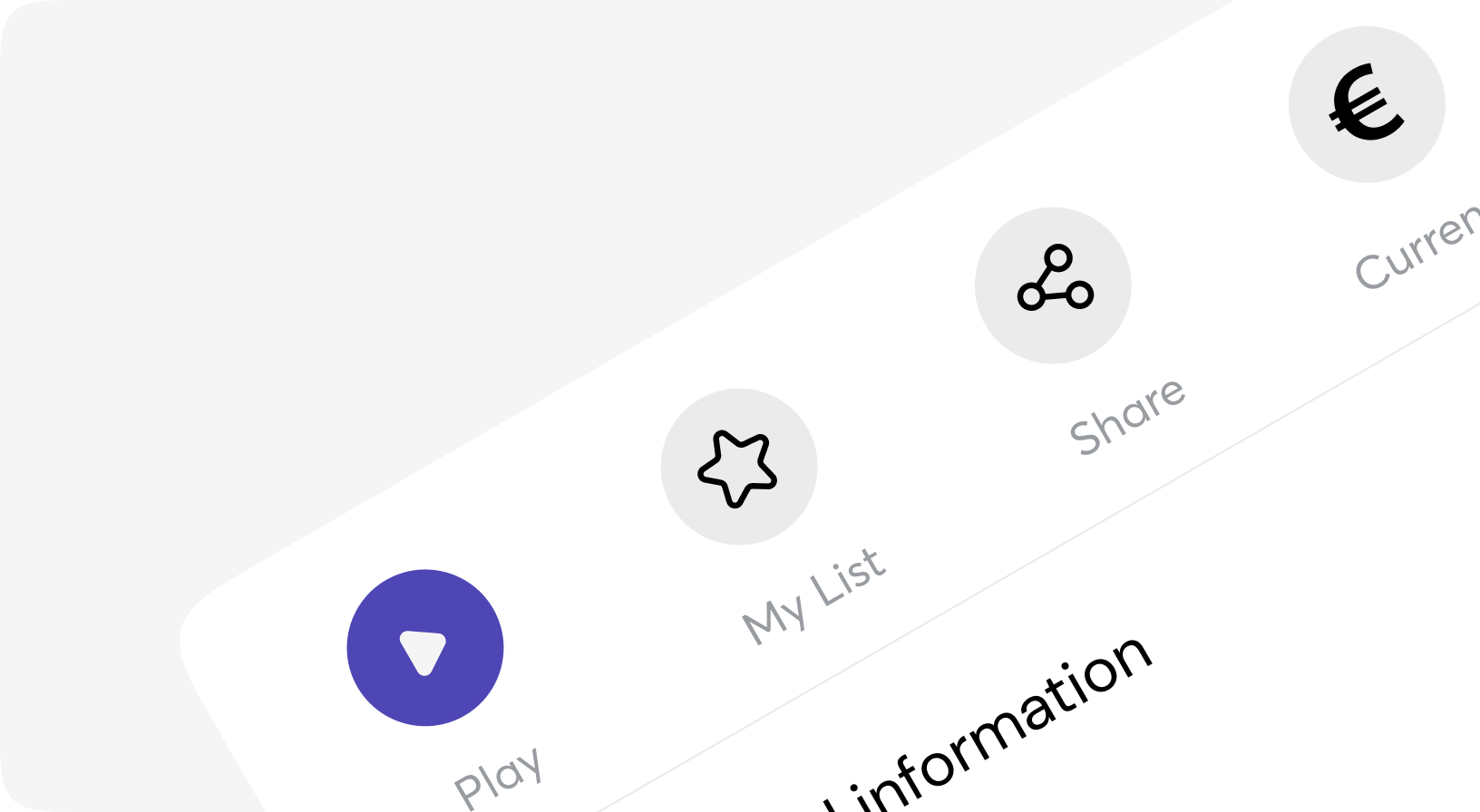
Default
Variants
Sizes
Disabled
Animation
Customization
Button.IconButton props
| Name | Type | Required | Default | Description |
|---|---|---|---|---|
| id | string | No | - | Id attribute for DOM element |
| rel | string | No | - | Rel attribute for DOM element |
| target | string | No | - | Target attribute for DOM element |
| aria_label | string | No | - | Aria label attribute for DOM element |
| attrs | keyword | No | [] | Additional attributes for DOM element |
| testid | string | No | - | Data-testid attribute for DOM element |
| value | string | No | - | Value attribute for DOM element |
| values | keyword | No | [] | list of additional values to associate with the DOM element |
| on_click | event | No | - | On click event |
| form | string | No | - | Form attribute for DOM element |
| type | string | No | "button" | Type attribute for DOM element |
| hover_bg_class | css_class | No | - | Additional Tailwind classes for hover background |
| icon | string | No | - | Icon |
| icon_only | string | No | - | Icon. To be deprecated. Use prop "icon" instead. |
| class | css_class | No | - | Additional Tailwind classes |
| animation | progress | success | error | pulse | No | - | Animation of button |
| disabled | boolean | No | - | Disabled button |
| href | string | No | - | A href attribute when prop as="a" |
| as | a | button | No | "button" | Rendered HTML element |
| size | xs | sm | md | lg | xl | No | "md" | Size of button |
| variant | fill | outline | ghost | No | "fill" | Visual/Logical variant of button |
| default | slot | No | - | Slot for customizations |