Progress
Aria
RTL
A progress indicator (Circular and Linear) is a visual representation of a user's progress through a set of steps, guiding toward the completion of a specified process.
Default
Different sizes
Different values
Custom colours
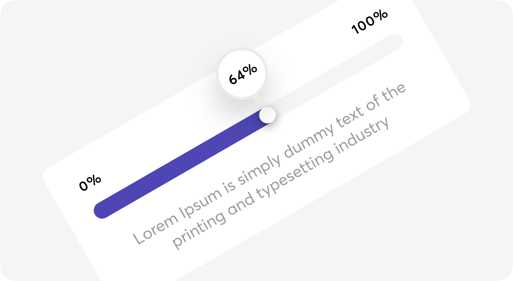
Progress with pin
75%
Progress props
| Name | Type | Required | Default | Description |
|---|---|---|---|---|
| id | string | No | - | Id of the component |
| testid | string | No | - | Data-testid attribute value |
| class | css_class | No | - | Tailwind classes for customization |
| bg_color | css_class | No | "bg-trunks/[.24]" | Background colour |
| progress_color | css_class | No | "bg-piccolo" | Progress bar colour |
| size | 6xs | 5xs | 4xs | 3xs | 2xs | No | "2xs" | Size of Progress |
| value | decimal | No | 0 | Value of Progress in % |
| pin | slot | No | - | Pin of Progress component, see Progress.Pin |
Progress.Pin props
| Name | Type | Required | Default | Description |
|---|---|---|---|---|
| id | string | No | - | Id of the component |
| testid | string | No | - | Data-testid attribute value |
| class | css_class | No | - | Tailwind classes for customization |
| size | css_class | No | - | Will be got from Progress in most cases |
| value | decimal | No | - | Will be got from Progress in most cases |