Checkbox
Aria
RTL
The checkbox is shown as a square box that is ticked (checked) when activated.
Checkboxes are used to let a user select one or more options of a limited number of choices.
Default
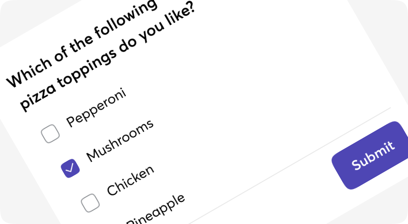
With form
Disabled
Readonly
Customizations
Multiple
Multiple with horizontal label
Form.Checkbox props
Checkbox to be rendered on form. Label is the root component. For rebdering outside the from please use Moon.Lego.Checkbox
| Name | Type | Required | Default | Description |
|---|---|---|---|---|
| id | string | No | - | Id to be given to the HTML tag |
| field | atom | No | - | Field name, surface-style |
| form | form | No | - | Form, surface-style |
| label | string | No | - | Label to be shown to user |
| disabled | boolean | No | - | If the field is disabled |
| readonly | boolean | No | - | If the field is read-only |
| testid | string | No | - | Data-testid attribute value |
| class | css_class | No | - | Class to be given to the visible checkbox |
| checkbox_label_class | css_class | No | - | Additional Tailwind classes for checkbox label |
| on_click | event | No | - | On_click event for the checkbox |
| checked_value | any | No | true | The value to be sent when the checkbox is checked. Defaults to "true" |
| hidden_input | boolean | No | true | Controls if this function will generate a hidden input to submit the unchecked value or not, defaults to "true". |
| unchecked_value | any | No | false | The value to be sent when the checkbox is unchecked, defaults to "false". |
| is_multiple | boolean | No | - | Adding [] to the field name for support multiple checkboxes with the same name |
| size | sm | md | lg | No | "md" | Size of the label |
| default | slot | No | - | Inner content - put label here |
Elixir.Moon.Lego.Checkbox props
Simple checkbox with or without selected mark to be used anywhere. Some SVG inside. Renders as a span
| Name | Type | Required | Default | Description |
|---|---|---|---|---|
| id | string | No | - | Id to be given to the HTML tag |
| testid | string | No | - | Data-testid attribute value |
| class | css_class | No | - | Class to be given to the visible checkbox |
| is_selected | boolean | No | - | If the checkbox has selected mark |
| on_click | event | No | - | On_click event for the checkbox |