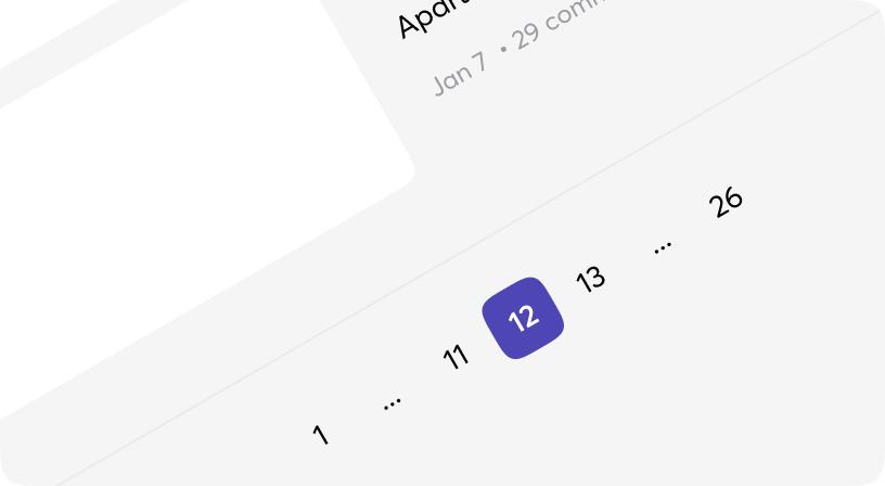
Pagination
RTL
Pagination is the process of splitting information over multiple pages instead of showing it all on a single page.
Also the name for the interface component used for navigating between these pages.

Anatomy
<Pagination>
  <Pagination.PrevButton>...</Pagination.PrevButton>
  <Pagination.Pages />
  <Pagination.NextButton>...</Pagination.NextButton>
</Pagination>
With icons
With text
With page hrefs
Pagination props
| Name | Type | Required | Default | Description |
|---|---|---|---|---|
| id | string | No | - | Id attribute for DOM element |
| total_pages | integer | Yes | - | The number of pages |
| on_change | event | Yes | - | The function to call when page is updated |
| testid | string | No | - | Data-testid attribute for DOM element |
| class | css_class | No | - | Additional Tailwind classes |
| value | integer | No | 1 | The value of current page |
| disabled | boolean | No | - | Disabled state for the prev/next button when were reached the first/last page. |
| prev_button | slot | Yes | - | Previous button of Pagination component, see Pagination.PrevButton |
| pages | slot | Yes | - | Pages of Pagination component, see Pagination.Pages |
| next_button | slot | Yes | - | Next button of Pagination component, see Pagination.NextButton |
Pagination.PrevButton props
| Name | Type | Required | Default | Description |
|---|---|---|---|---|
| id | string | No | - | Id attribute for DOM element |
| testid | string | No | - | Data-testid attribute for DOM element |
| class | css_class | No | - | Additional Tailwind classes |
| hover_bg_class | css_class | No | - | Additional Tailwind classes for hover background |
| variant | fill | outline | ghost | No | "outline" | Visual/Logical variant of button |
| size | xs | sm | md | lg | xl | No | "sm" | Size of button |
| on_change | event | No | - | Will be got from Pagination in most cases |
| value | integer | No | - | Will be got from Pagination in most cases |
| disabled | boolean | No | - | Will be got from Pagination in most cases |
| default | slot | No | - | Inner content of the component |
Pagination.NextButton props
| Name | Type | Required | Default | Description |
|---|---|---|---|---|
| id | string | No | - | Id attribute for DOM element |
| testid | string | No | - | Data-testid attribute for DOM element |
| class | css_class | No | - | Additional Tailwind classes |
| hover_bg_class | css_class | No | - | Additional Tailwind classes for hover background |
| variant | fill | outline | ghost | No | "outline" | Visual/Logical variant of button |
| size | xs | sm | md | lg | xl | No | "sm" | Size of button |
| on_change | event | No | - | Will be got from Pagination in most cases |
| value | integer | No | - | Will be got from Pagination in most cases |
| disabled | boolean | No | - | Will be got from Pagination in most cases |
| default | slot | No | - | Inner content of the component |
Pagination.Pages props
| Name | Type | Required | Default | Description |
|---|---|---|---|---|
| id | string | No | - | Id attribute for DOM element |
| testid | string | No | - | Data-testid attribute for DOM element |
| class | css_class | No | - | Additional Tailwind classes |
| button_class | css_class | No | - | Additional Tailwind classes for page buttons |
| truncable_text | string | No | "..." | Text to render if a one or more pages are truncated. |
| truncable_text_class | css_class | No | - | Additional Tailwind classes for truncable text |
| default_bg_color | css_class | No | "bg-transparent focus:bg-jiren hover:bg-jiren" | Additional Tailwind classes for background color of page buttons in default state |
| selected_bg_color | css_class | No | "bg-piccolo text-goten" | Additional Tailwind classes for background color of page buttons in selected state |
| total_pages | integer | No | - | Will be got from Pagination in most cases |
| on_change | event | No | - | Will be got from Pagination in most cases |
| value | integer | No | - | Will be got from Pagination in most cases |